Originally published on the Nonprofit Technology Network's Connect Blog.

Most of us don’t look at our site analytics. At least, not often enough. We know we should, but life gets in the way. How do we make it easier for nonprofits to truly take a “data-driven” approach to their work?
I’ve found success with putting the analytics where people will see them. One of those places is the website itself.
Figure Out What Really Matters
There’s no shortage of data to review. So, it’s important to move beyond vanity metrics and get to the heart of why we do what we do. This means turning to the goals and key performance indicators you have for your website (or defining them for the first time!).
For my work at Agaric, those goals are:
1. Secure well-matched projects by communicating the value we provide to potential clients.
Key performance indicator: feedback on design and content from target audiences.
2. Diversify and expand free software communities by sharing relevant knowledge.
Key performance indicator: pageviews of blog posts.
Each goal should be accompanied by at least one key performance indicator. This is data that tells you how successful you are being at reaching your goal.
In our case, our first goal of feedback is best measured qualitatively by asking our current clients— and those who we like working with—what they think of the website. We conduct interviews to gather that feedback. For our second goal, we can get a good picture of content relevance by pageviews, a valuable data point to share with the team.
A different site might try to increase one-time donations, in which case seeing the number of donations made during a campaign would be helpful. Another group might focus on building a regular readership, therefore email list sign ups are the best indicator of success. Whatever it is, make sure you can link the analytics you are tracking back to a goal you have for your site. There’s no point in measuring something you won’t take action on.
Know Who Needs to See the Data and Where They Hang Out
After identifying your key performance indicators, decide who on your team should review that data.
For our six-person worker-owned cooperative, that answer was easy – all of us. We all blog and we all have a vested interest in helping our free software communities thrive. We want to know which posts are resonating the most.
After knowing your target audience, find out where they spend their time. In our case, it’s the website’s back-end content overview page. Our website admins go here to pull up a page we want to update and to see what posts are still in draft mode. So, we added a column for pageviews and made that column sortable.
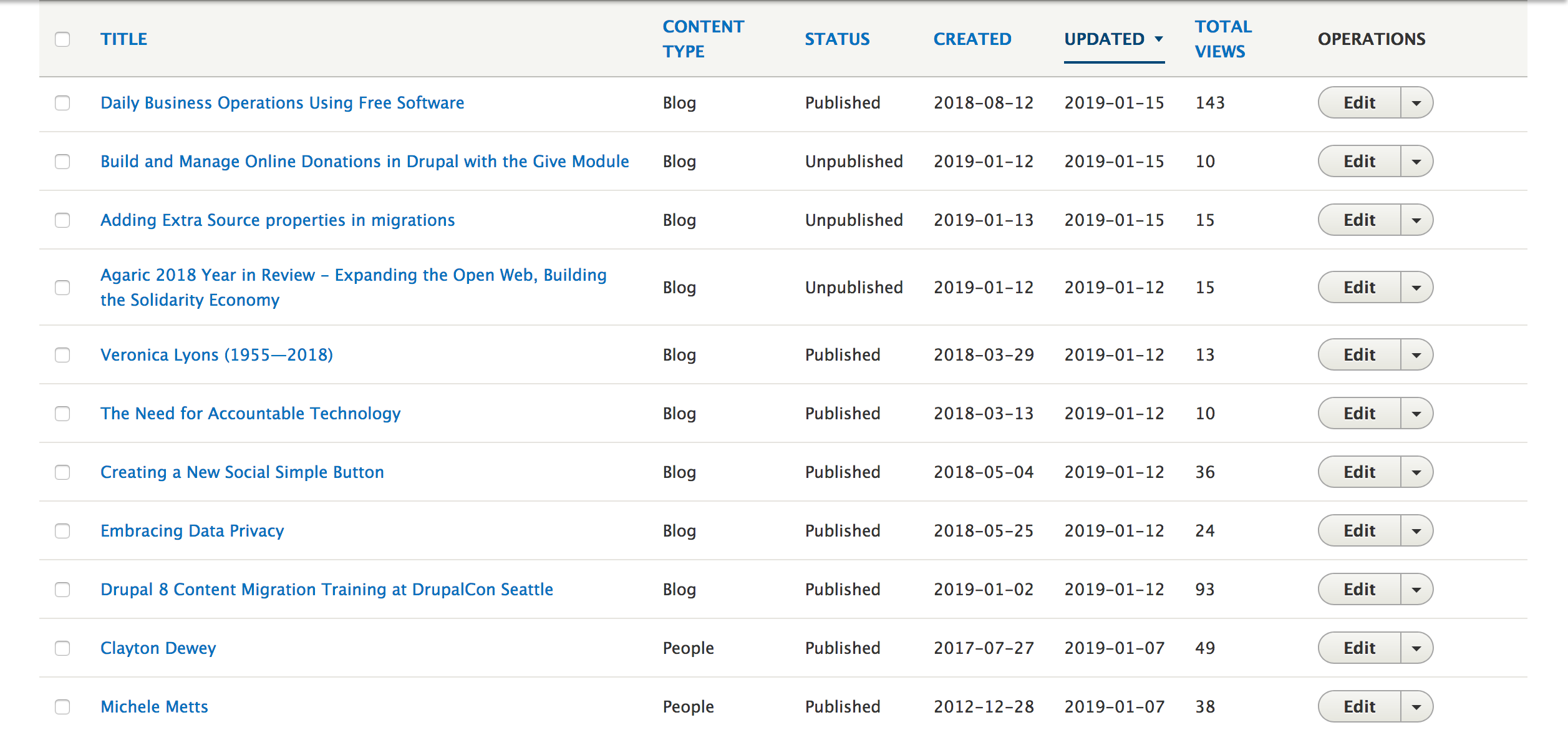 This content overview page was customized to include each post's total pageview count.
For the independent news site Portside, the same was true. In addition to showing pageviews on their content overview page, they also include them directly on each post (visible only to content editors).
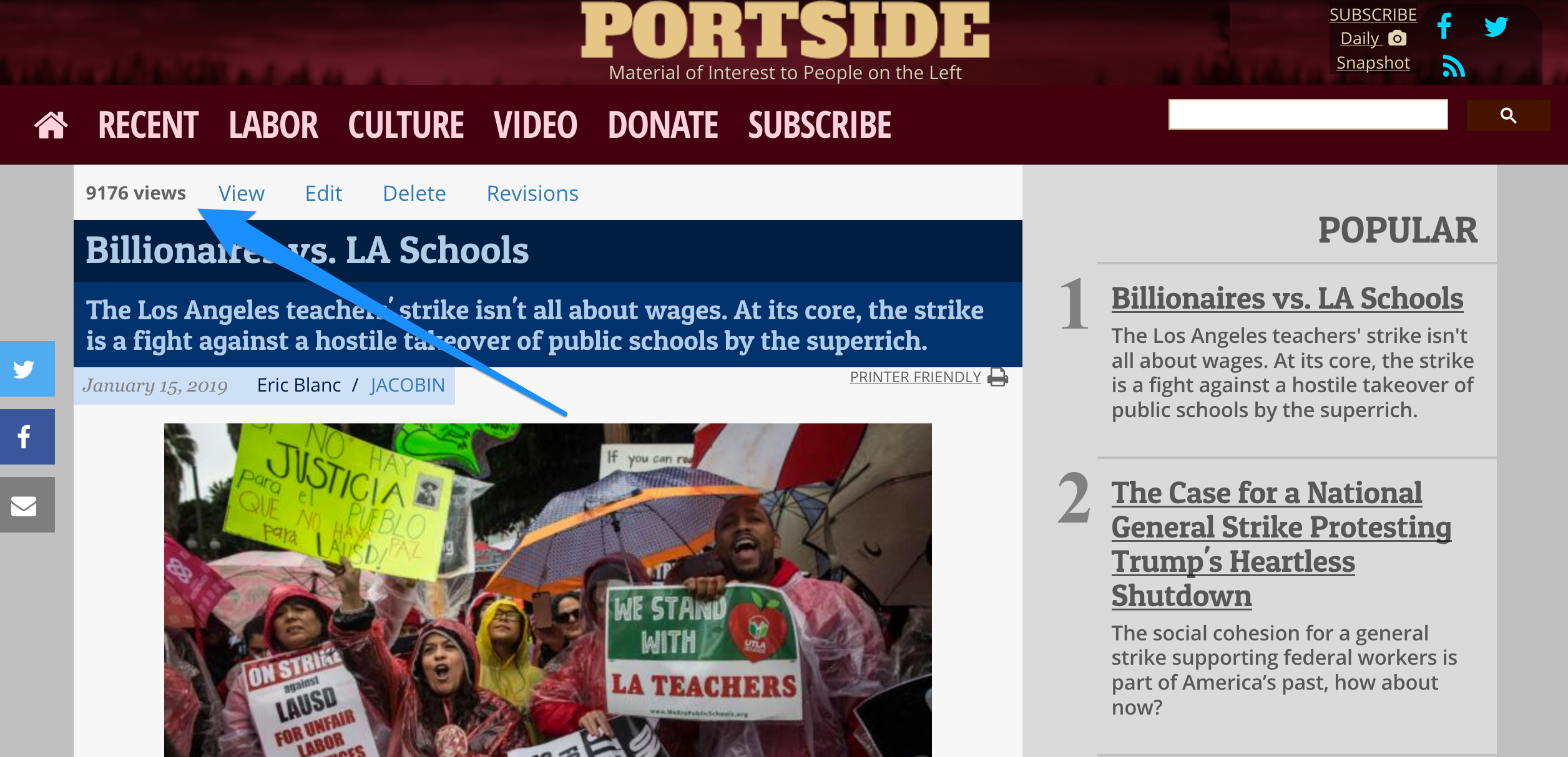 Showing the pageview count on the page itself makes it clear to content editors how popular it is.
For the online educator portal Teachers with Guts, the organization wanted to track several data points on their members’ use of the platform. So, they have a report page built into the site showing information such as the number of downloads made, comments left, and pages bookmarked.
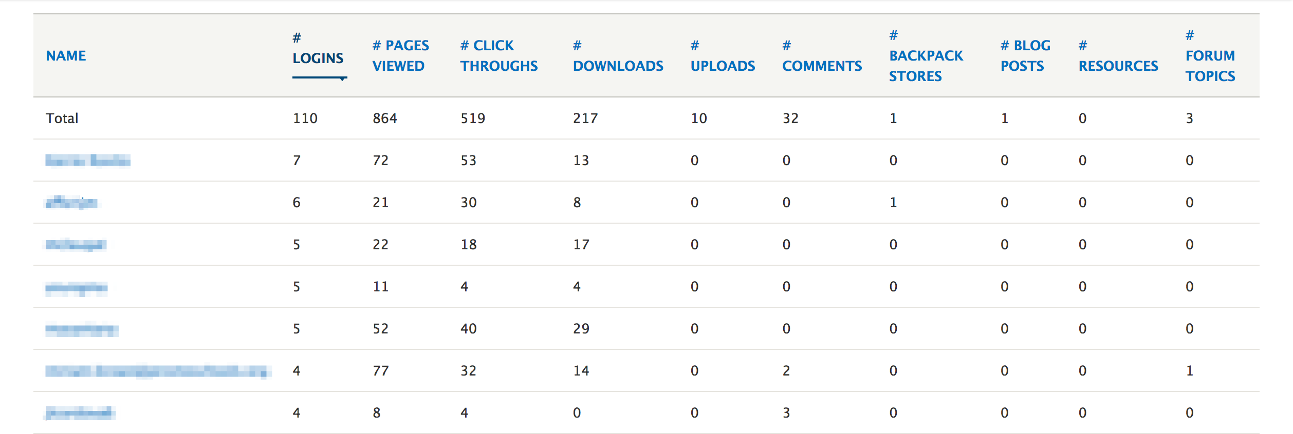 Teachers With Guts began tracking user engagement to inform how they manage their online portal.
Other opportunities to share analytics include weekly email reports, a user dashboard upon logging in, or via mobile texting or apps. Don’t be shy about asking your team where they would most likely notice the data you’re sharing with them.
Meaningful, Informed Conversations
By showing key data in high traffic areas, you foster an informed team. From there you can have the conversations you want and need. We now know which posts are getting the most reach and are evaluating why that is. As a result, our best practices have evolved to make our writing more relevant with readers.

Comments
Add new comment